
Reading Experimental Data and Drawing Best-Fit Lines: The Science Skill Students Often Underestimate

Students often think graph questions are easy because the information is already provided. Yet data-handling marks are frequently lost through poor scales, inaccurate plotting, weak descriptions and conclusions that go beyond the evidence. Parents assessing the Best Science Tuition Singapore should look for teaching that treats graphs as a form of scientific reasoning, not as a drawing exercise completed at the end of a practical.
A well-constructed graph allows a student to see a relationship that may be difficult to recognise in a table. It can reveal trends, proportionality, anomalies and limits. However, each of these conclusions depends on how carefully the data is read and represented. A line that looks neat is not necessarily a valid best-fit line, and a rising graph does not automatically prove that one variable caused the other.
Start with the Table Before Touching the Axes
Many plotting errors begin because students rush directly to the graph grid. They should first inspect the data table.
The student needs to identify the independent variable, which is usually the quantity deliberately changed, and the dependent variable, which is the measured response. The units must also be noted. If the table contains repeated measurements or a calculated mean, the student should know which values are intended for plotting.
This first reading can reveal suspicious data. One value may differ greatly from the pattern, a unit may change between columns or the intervals may be uneven. Noticing these features before plotting prevents confusion later.
Students should also estimate the expected graph shape. The aim is not to force the points into that prediction, but to create a mental reference. If the finished graph looks entirely different, the student knows to recheck the axes, coordinates and scale.
Put the Correct Variable on Each Axis
A common convention is to place the independent variable on the horizontal axis and the dependent variable on the vertical axis. Students should not rely only on memory, however. They should understand that the graph shows how the measured response changes as the selected variable changes.
Each axis label should contain the quantity and the unit. Writing only “time” or “temperature” may be incomplete when the unit is seconds or degrees Celsius. Symbols can be used when they are clear and consistent with the question.
The labels should be written outside the plotting region so they do not interfere with the data. Neat placement matters because a graph is intended to communicate information quickly.
Choose a Scale That Uses the Grid Well
Scale selection is one of the most underestimated graph skills. Students sometimes choose a scale that leaves most of the grid empty, begins at an unsuitable value or uses intervals that are difficult to calculate mentally.
A good scale should cover the full data range and use a substantial part of the available grid. It should progress consistently. Convenient intervals such as 1, 2, 5 or 10 units per major square are usually easier to use than awkward intervals.
The axis does not always need to begin at zero. Whether a non-zero origin is appropriate depends on the question, the type of graph and the required interpretation. When the origin is omitted, the scale must still be clear and should not visually mislead the reader.
Before plotting, students should test the scale against the largest and smallest values. This ten-second check can prevent the need to redraw the entire graph.
Plot Points with Precision
Plotting is not simply placing a large dot near the expected location. Each coordinate should be positioned as accurately as the grid permits.
A small cross is often clearer than a thick dot because its centre can be identified. The plotting mark should not cover a large area or make it impossible to judge the coordinate.
Students should plot one point at a time, reading from the table and then checking the coordinate before moving on. After all points are added, they should compare the overall shape with the table. A point that appears far from the pattern may be an anomalous result, but it may also be a plotting mistake.
The student should verify the coordinate before labelling it anomalous. Scientific judgement begins with checking one’s own representation.
Understand What a Best-Fit Line Is Doing
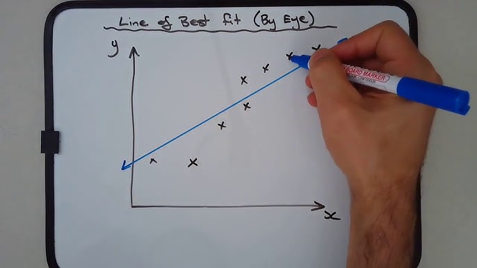
A best-fit line or curve represents the overall relationship shown by the data. It is not a dot-to-dot path.
Joining every point suggests that each small rise and fall is meaningful, even when the variation may come from measurement uncertainty. A best-fit line smooths the random scatter and helps reveal the underlying trend.
For a straight best-fit line, students should consider whether the points are reasonably balanced above and below it. The line should follow the centre of the data pattern rather than being forced through the first and last points.
The line does not always have to pass through the origin. It should do so only when the data and scientific relationship justify that choice. Forcing it through zero because “graphs should start at zero” can distort the evidence.
Some data requires a smooth curve rather than a straight line. The student should look at the changing gradient and the scientific context. A curve should be drawn smoothly, not as several short straight segments.
Treat Anomalies Carefully
An anomalous point does not fit the overall pattern. Students often circle such a point immediately and ignore it. A stronger response first checks whether it was plotted correctly and whether the original table was copied accurately.
If the point remains unusual, the student can consider possible experimental reasons. These may include a reading error, an uncontrolled variable, equipment limitations or an unusual event during the procedure.
The student should not invent a cause without evidence. It is better to state a plausible limitation linked to the method than to make a confident claim that cannot be supported.
Whether an anomalous point should influence the best-fit line depends on the instructions and the data pattern. The line should represent the main trend, but students must not remove inconvenient data simply to create the graph they expected.
Describe the Relationship Precisely
“The graph goes up” is rarely a strong scientific description.
A better answer identifies the variables and explains how the dependent variable changes as the independent variable changes. It may note that the increase is linear, becomes less steep, remains constant after a point or changes in stages.
Students should distinguish between describing and explaining. A description reports the pattern visible in the graph. An explanation uses scientific ideas to account for that pattern.
When the question asks for a conclusion based on data, the student should stay within the measured range. Extrapolating far beyond the final data point may be unreliable because the relationship could change.
Calculate Gradient with a Large Triangle
The gradient represents the rate at which one quantity changes with another. In many Science and Physics contexts, it has a specific physical meaning.
Students should choose two points far apart on the best-fit line, not necessarily two original data points. A large gradient triangle reduces the relative effect of reading uncertainty.
The calculation should show the change in the vertical quantity divided by the change in the horizontal quantity. Units should be included and simplified where appropriate.
A frequent error is reversing the numerator and denominator. Students can prevent this by reading the axes before substituting and asking, “How much does the vertical quantity change for each unit change in the horizontal quantity?”
Connect Graph Skills to Practical Reasoning
Graphs are not isolated examination techniques. They help students evaluate whether an experiment supports a proposed relationship.
After drawing the best-fit line, a student should be able to discuss the spread of points, identify anomalies, estimate values and comment on whether the trend is convincing. A large scatter may suggest that measurements are not sufficiently precise or that important variables were not controlled well.
Students should also understand the difference between interpolation and extrapolation. Estimating within the measured range is generally better supported than predicting outside it.
Build a Reliable Graph-Checking Routine
Before submitting a graph, the student should pause and inspect it as a reader would. Are the quantities and units obvious? Does the scale progress consistently? Are the points small and accurate? Does the best-fit line represent the trend rather than connect the dots? Is any gradient triangle large enough?
This check should become part of ordinary homework. Students who practise it only before an examination are more likely to forget a step under pressure.
The Science and Physics programmes available through TGC ACADEMY can support students who need more structured work with data, graphs and experimental reasoning. The goal should be to make the student capable of interpreting evidence independently, not simply to produce a visually neat graph.
Frequently Asked Questions
Q. Must a graph always begin at zero?
Ans. No. The correct starting point depends on the data range, the question and the type of interpretation required. A non-zero start must still be clearly labelled and should not create a misleading impression.
Q. Should students join every plotted point?
Ans. Usually not when the task asks for a best-fit line or curve. Joining every point can exaggerate random variation and hide the overall relationship.
Q. Does a best-fit line have to pass through the origin?
Ans. Only when the evidence and scientific relationship justify it. Students should not force the line through zero by habit.
Q. Can two students draw slightly different best-fit lines?
Ans. Yes. There can be a reasonable range of acceptable lines when the data has scatter. The important point is that the line represents the overall trend and is balanced sensibly among the points.
Q. Why should a gradient triangle be large?
Ans. A larger triangle reduces the relative effect of small coordinate-reading errors and usually produces a more reliable gradient.
A Graph Is an Argument Based on Evidence
Drawing a graph is not a mechanical task completed after collecting numbers. Every decision, from choosing the axes to interpreting the gradient, affects what the evidence appears to show.
Students who learn to read tables carefully, plot precisely and draw a justified best-fit line gain more than a few easy marks. They develop the ability to turn measurements into a defensible scientific conclusion, a skill that remains valuable across Physics, Chemistry and Biology.

Comments are closed.